Gogo’s REstaraunt Brand Identity & Packaging Design
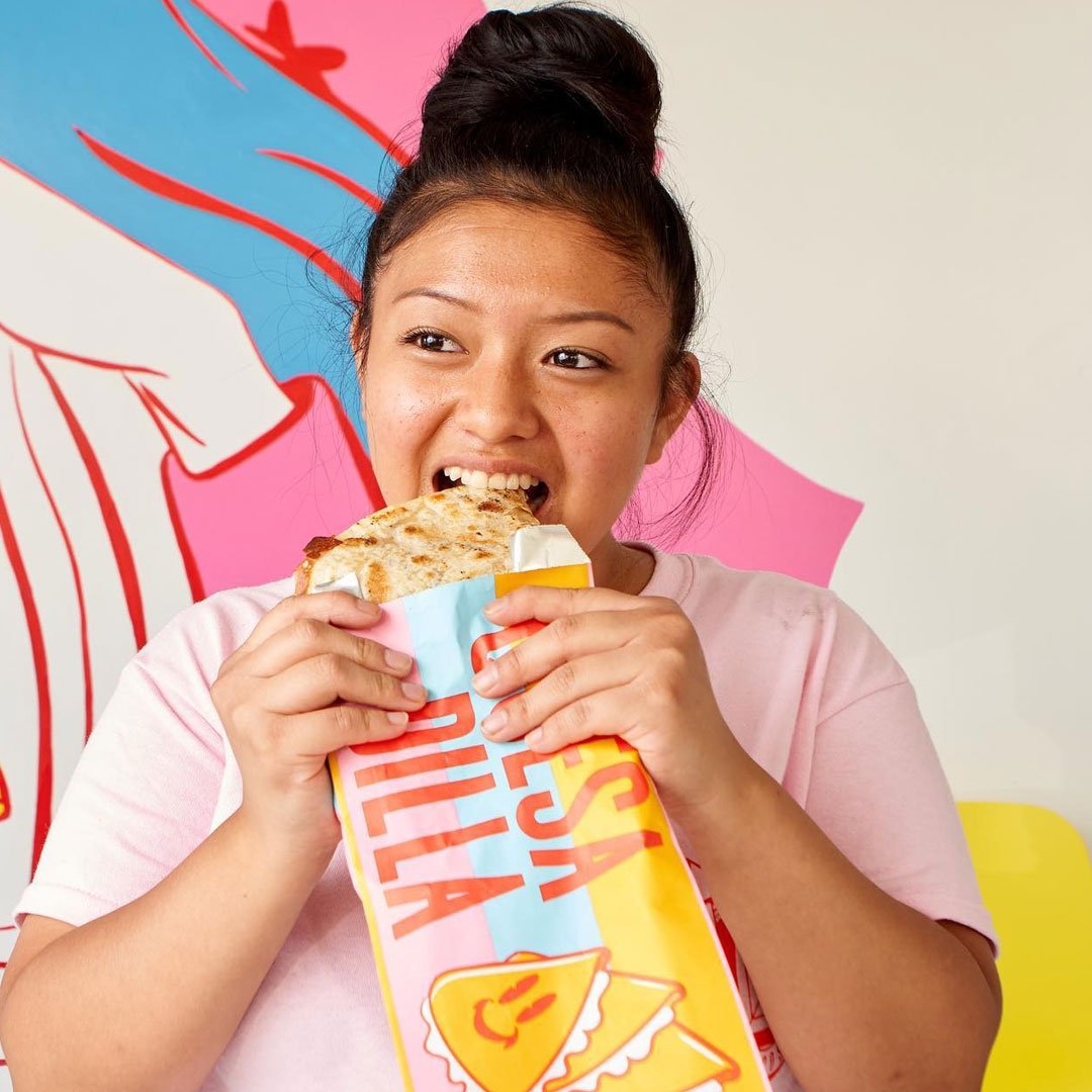
Gogo’s Tacos was a project born from the brains behind the legendary Gorillas Tacos. Gogo’s Tacos was meant to be “In N Out” of tacos. Multiple locations with a similar experience of quality and taste matched with an Iconic brand system that is instantly recognizable.
Owner Brittany Chavez and her teams wanted a brand that uplifted and honored the car culture of East Los Angeles that was still accessible and distinct to the larger consumer base outside of Latino Culture.
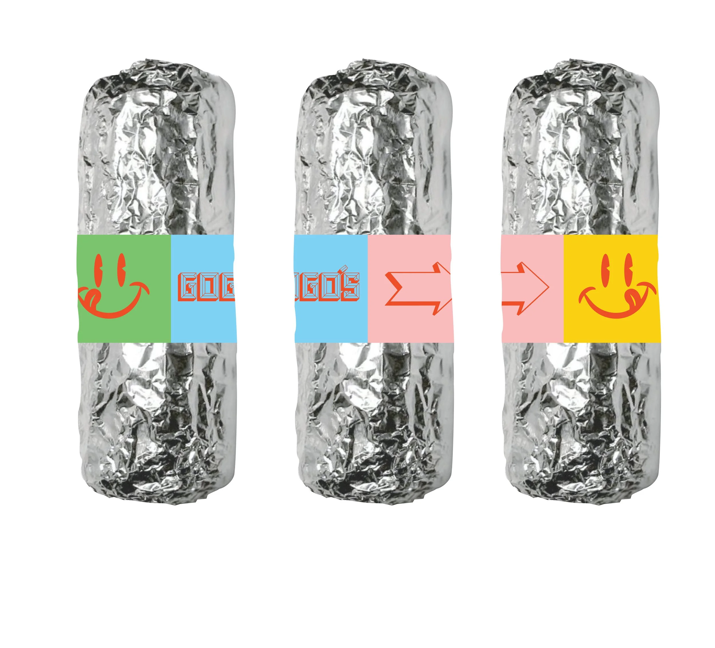
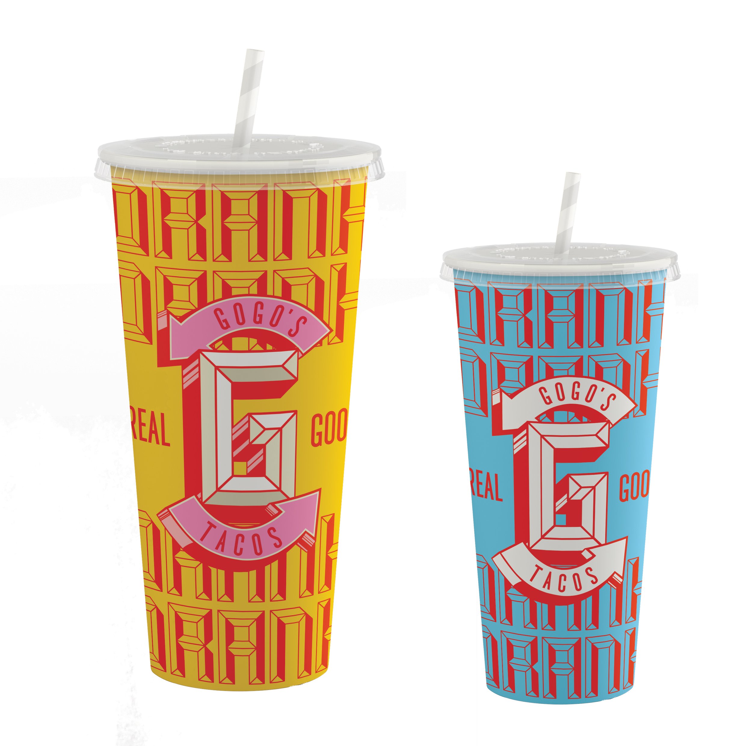
Taking Inspiration from vibrant candy-colored paint, hand-painted murals, and heavy chrome plating, the logo achieves the hypnotic polish that is synonymous with lowriders. Leaning on old diners and drive-thru’s where lowriders would meet before & after cruising, the responsive logo system successfully invokes those feelings of nostalgia these spaces invoke.
Done at Born In June Creative
Role .................. Creative direction , design, illustration
Team .................. Joshua Sandoval
Photography ........... Various Photographers
Field ................. Identity, Custom Typography, Illustration, []
Typefaces ............. custom type, Montserrat.
Published ............. May 2022